Apache Superset - A Free Software Data Visualization Tool
M V Sri Harsha
Introduction
Consuming large sets of data isn’t always straightforward. Sometimes, datasets are so large that it’s downright impossible to discern anything useful from them. This is where Data Visualizations come in. The most integral part of data visualization is to present the data in such a way that it can be easily understandable and interactive to non-technical professionals.
Creating data visualizations is rarely straightforward, it will take dozens of hours with a dataset having thousands of entries to create visualizations from scratch. That’s where data visualization tools come in.
Data visualization tools provide data visualization designers with an easier way to create visual representations of large datasets. Apache Superset is such a data visualization tool with easy to use and customizable data visualizations.
Apache Superset

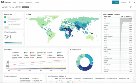
Apache Superset (incubating) is a modern, enterprise-ready business intelligence web application. It is fast, lightweight, intuitive, and loaded with options that make it easy for users of all skill sets to explore and visualize their data, from simple pie charts to highly detailed geospatial charts.
Apache Superset is a Free Software application under the Apache 2.0 license which is written by the Apache Software Foundation. It allows users to use the software for any purpose, to distribute it, to modify it, and to distribute modified versions of the software under the terms of the license.
Key features of Superset
- An intuitive interface to explore and visualize datasets, and create interactive dashboards.
- It has a wide array of beautiful visualizations to showcase your data.
- Easy, code-free, user flows to drill down, slice and dice the data underlying exposed dashboards. The charts act as a starting point for deeper analysis.
- SQL editor/IDE exposes a rich metadata browser, and an easy workflow.
- Integration with major authentication backends (database, OpenID, LDAP, OAuth, REMOTE_USER, ...)
- A lightweight semantic layer, allowing to control how data sources are exposed to the user by defining dimensions and metrics
- Fast loading dashboards with configurable caching
Privacy and Scalability
Since Superset is a Free Software application. Unlike other data visualization tools, it can be deployed on your machine(s) which ensures that your data stays private.
Scalability is the biggest concern today as the datasets are huge. Hence Superset is designed to scale out to large, distributed environments and works very well inside containers. You can try superset simply from your laptop to deploying it in a complex distributed environments. There’s virtually no limit to scale out the platform.
Superset users in the wild
- Airbnb
- Faasos
- Lyft
- American Express
- Netflix
- Udemy
- TwitterThe list goes on…
Where can I use it today?
Let's take an example of COVID-19. Since the pandemic started, many government agencies and data scientists started to map and build dashboards of the COVID-19 data to see and predict its growth. Now as a data science enthusiast, even we can build a simple COVID-19 dashboard using Superset.
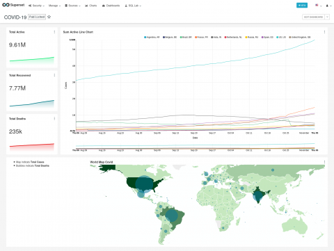
With 3 Steps let's build a simple dashboard. Upload, Visualize Table and Publish
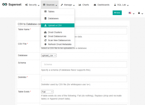
Step 1: Loading CSV Data
Upload the CSV dataset, enter the Table Name and click on the Save button.
Step 2: Table Visualization
Step 2 is more of a two part series
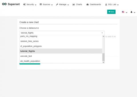
Step 2.1: Import datasource and Select chart
To create a new chart, select New > Chart then choose a data-source (in our case covid_data) from the dropdown list.
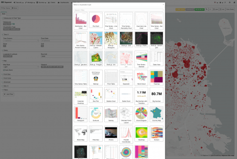
Now select the visualization type, then select Create new chart to go into the chart view.
Step 2.2: Choose filters or Run Query
Now apply the filters or run custom queries on the data. Here, a saved query is called a Slice. Select Run to see the visualization.
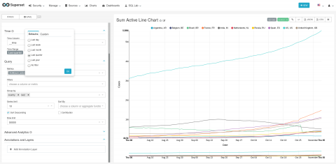
Now click the Save as button near top-left corner . A up should appear, asking to name the slice, and optionally add it to a dashboard. Since we haven’t yet created any dashboards, we can create one and immediately add our slice to it.
Step 3: Publish
Now that you have the dashboard ready with the line chart. It's ready to get published so that it's available to other users. To Publish simply select Draft next to the title of your dashboard on the top left to change your dashboard to be in Published state.
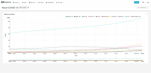
Hurray!!! We have created a COVID-19 Dashboard...
This example is just taken as an introduction to Superset. There are many more charts to explore which are beyond the scope of this article.
Tags

M V Sri Harsha,
Hacktivist at Swecha,
Data Engineer Newsclick